
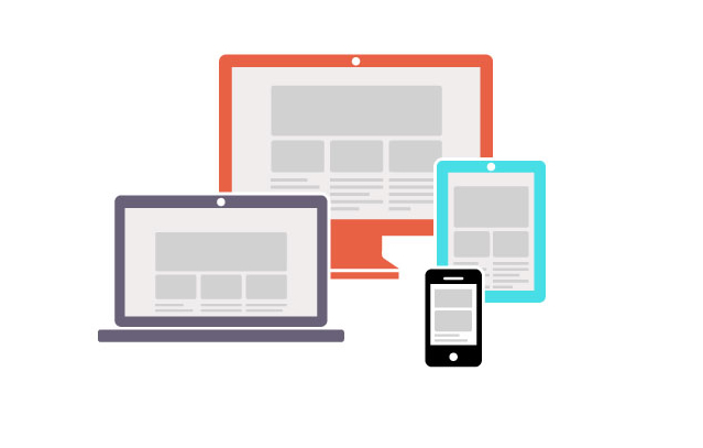

Responsive design is an approach that enables websites to adjust and respond to the device that it is viewed through. With this approach you can provide an optimal brand experience via your website regardless of how your users access it. Responsive design doesn’t only apply to websites; it applies emails and other digital media.
Why Does it Matter?
56% of all American adults own a smartphone (June 5th, 2013 Pew American Life), 34% of American adults own a tablet (June 10, 2013 Pew American Life). These numbers are expected to grow in the future.

It’s a multi-screen world. Consumers use multiple devices and often move among screens to get things done. Responsive design enables you to provide a consistent brand experience while consumers move among devices.
How Does it Work?
Responsive design works by adapting the layout, showing and hiding selected information depending on the screen resolution of the device.
Media queries are used to adapt the design to screen size of the device.
Most often, you’ll notice the following adaptations:
- Navigation is adapted to mimic a native navigation users have come to expect.
- Content is organized by priority, and is rearranged to keep readability.
- Images become fluid in width, removed or resized to be smaller sizes.
- Galleries and image carousels become touch sensitive to mimic native touch gestures.
- Zooming is always disabled or restricted.
Working with a Responsive Website or Email
There is a paradigm shift that comes with responsive design. Usability of every element on the page become very important due to the fact it should work well in multiple screen sizes. Understanding how consumers behave on websites provide us necessary guidance to create best practices.
Most important of those behaviors are the three I call F-10-S.
- F Pattern – visitors focus in F
Usability studies that have been conducted always show that users view web pages in an F pattern.

- 10 Second Rule – 10 seconds to leave or stay
Within the first 10 seconds of visiting a web page, a website visitor will determine if the page they landed on is relevant to them and if they will stay on the page or leave the page. - Skim – Skimming your content instead of reading
Usability studies show that your website visitors don’t read pages from top to bottom. They skim pages – even when they are tasked with an important task or performing research.
With that understanding, here are some best practices to make the most of your responsive design.
Best Practices to Follow When Working With Responsive Design
Think mobile first
Mobile users are a bit more impatient than desktop users. Also, you have a unique challenge of telling your mobile user “this is the page for you” in 10 seconds, with very little screen landscape. Thinking mobile first will help you create a better strategy for web page’s content, layout and design. According to a recent study performed by Google, most searches start with a mobile device. Same study found that 60% of the time spent on smart phones is done at home (The New Multi-Screen World Study, Google). Another thing to note is that online mobile traffic is expected exceed fixed (desktop/laptop) traffic in 2014.
Think visitor expectations before business need
This approach is also called “user-centric” design. Thinking about what your visitor’s goals are and what will help your visitor accomplish her goals will help you win the 10 Second Rule, thereby helping you achieve your business goals.
Write newspaper style web content
Journalists put the most important content at the top. They also write headlines that convey context to reader who is reading the headline. This will help you win the 10 Second Rule and also help get the point across, knowing most of your web visitors skim your content.
Be critical of purpose and value of all content on page
Make it a habit to be critical of any and all content on a web page and why it is there. Is it serving a purpose? Is it adding value to a user? Can you cut it in half and achieve the same result? Continue to optimize content.
Section content into short paragraphs with descriptive headlines
This will enhance your user experience by helping the visitor skim through content with ease. You’ll achieve your business goals too, by helping the visitor view your content.
Semantically correct content input
Add meaning to by inputting semantically correct content. Some examples include: classifying headings as (h1, h2, h3), classifying paragraphs as paragraph text, and not using <b> for bolding and <i> for italicizing – since these only covey format.