
Email marketing continues to perform well despite the increase in number of emails we receive. B2B marketers intend to continue to increase their investment in email marketing. Email has become an intricate part of any digital marketing campaign. Email marketers have faced many challenges in the past, fighting spam filters, cutting through the clutter etc. Marketers today are facing a new challenge.
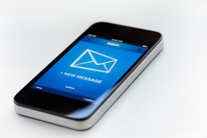
Today people read and manage email using multiple devices. Rise in mobile usage has accounted for an instant reaction to your email by people.
50% of all American adults sent or received email using a mobile phone.
– This number was higher for those with higher education and for those who lived in relatively higher income households (Pew Internet and American Life Project).
59% of newsletters were read on a phone while the user had access to a desktop or laptop computer.
Email was the top activity performed during simultaneous screen usage.
– The New Multi-Screen World, Google/Ipsos/Sterling, US, Aug 2012
Why Should You Optimize Email for Mobile?
By now you see that your users are interacting with your email messages on mobile devices. Their experience with your email newsletter will determine if they will open your newsletter, save it for later or delete it.
Their experience with your email newsletter may impact your brand as well. Nielsen Norman Group found that users have an emotional reaction to email newsletters. The positive aspect of this emotional relationship is that email newsletters can create more of a bond between users and a company. The negative aspect is that email usability problems have a much stronger impact.
How to Optimize Your Email Newsletter For Mobile
There are some things that you can do now with little to no effort to optimize your email newsletters for mobile devices.
-
Write concise, direct, and relevant subject lines:
I may have packed way too many adjectives here, but this is important. People make a decision to delete, keep or read your email based on sender and subject. Write concise, yet relevant subject line that gives your reader an idea on what to expect in the email newsletter. -
Use the pre-header as an extension of your subject line to provide more context:
This is the top most part of your email. You’ve probably seen this area to contain statements like “If you cannot view this email click here”. Using this area as an extension of your subject line gives the user more context almost all devices. This gives your email more chances of begin read! Here are some examples of pre-headers in email.

Proper use of email pre-header Here’s how above looks in mobile preview. Pre-header text that is displayed under the subject here is very similar to additional content displayed in previews on Outlook, Android, iPad and even in most email alerts.

Pre-header supplements subject on most mobile phones and email clients. Below you’ll find an example of most email pre-headers. Notice how it doesn’t give additional context in preview or mobile view.

Most common but a poor use of the email pre-header 
See how this pre-header does not support the subject? “Web Version” “Forward to a Friend” doesn’t help you or the recipient here. -
Chunk your content into skimmable sections:
Over 69% of the emails are skimmed by people. Most people glance at and read headlines in your email. Chunk your content into skimmable parts and lead each section with an contextual headline. -
Make your email newsletter template responsive:
Unlike the first three steps, this step will take a bit of time, testing and preparation. The first two steps will give the user more context about your email improve the open rates of your email. This step will improve your email newsletter’s user experience once the user opens your email.
If you’ve read email newsletters in your mobile device, you’ll know that your experience can vary from pleasant to horrific. Create responsive email templates for your email campaigns so that your user experiences are pleasant.
What is a responsive email template?
An email template that adapts to fit the device screen size is a responsive email template. To explain this better I’ve put together the images below.
Below image shows how a non responsive email template behaves. Notice how the user does not see all the contents of the email (portion in red in not visible without scrolling) and requires the user to scroll horizontally? Horizontal scrolling is not so intuitive, this does not provide your user a good brand experience.

User has to scroll horizontally to read the contents of your email. Below image shows how a responsive email will behave and promote an enhanced user experience – thus a pleasant brand experience.

Email template adapts to device screen. In a world where your customers are multi-tasking and multi-screening, responsive email templates will make sure that your customer experiences are optimal regardless of the device they are using.
Here’s a helpful guide on how to create responsive email template.
UPDATE:
Here are some helpful real life examples of responsive email campaigns by Marketing Land. Note that I do not agree with removing the pre-header, instead I am all for better use of it. As a matter of fact, pre-header is more important for mobile devices than desktops.